There’s a particular light in Arizona in late August, right after a monsoon storm clears. The sky goes soft and bruised — dusty rose, ochre, a wash of gray-violet along the mountains — and the whole desert looks like it’s been lit from inside.
We think about that light constantly this time of year. Because couples marrying in late summer and early fall are asking us a version of the same question: what season is my wedding, actually? The invitations go out in the heat. The wedding happens as things are just beginning to turn. Nothing on a standard seasonal color chart quite fits.
The good news is that the in-between is the most beautiful place to design from.
Let go of “summer colors” and “fall colors”
The seasonal palette categories most of us have absorbed — bright and coastal for summer, rust and burgundy for autumn — are borrowed from climates that aren’t ours. A late-September wedding here does not look like a New England October. Designing your suite as though it does creates a quiet mismatch between the paper in a guest’s hand and the day they actually attend.
Instead of choosing a season, choose a time of day. Late-summer weddings tend to live at dusk, when the heat finally breaks and everything goes golden. Build the palette from that hour, and the suite will feel true no matter which month the calendar claims.
The palette we keep returning to
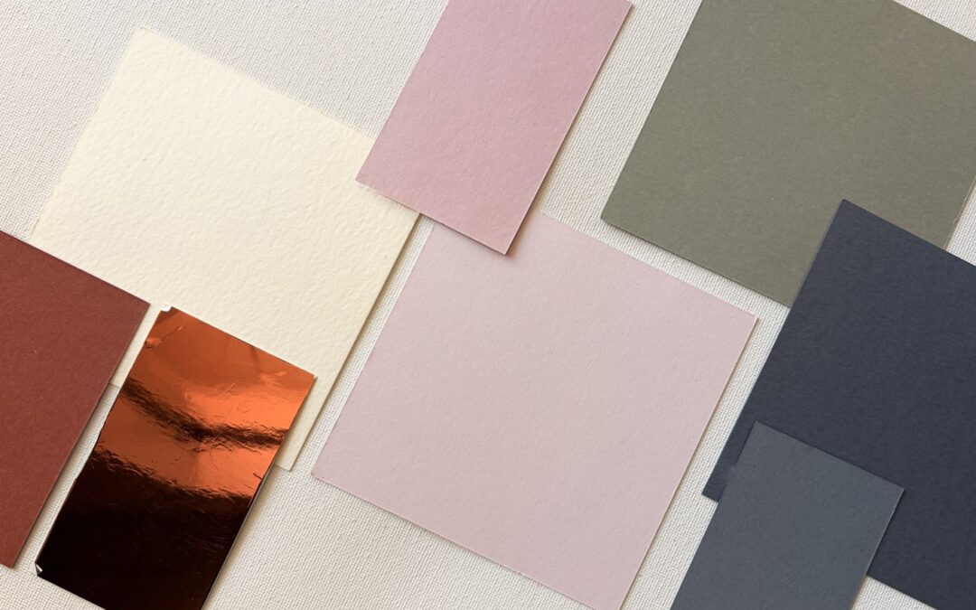
Our favorite late-season combination is warmer than summer and softer than fall:
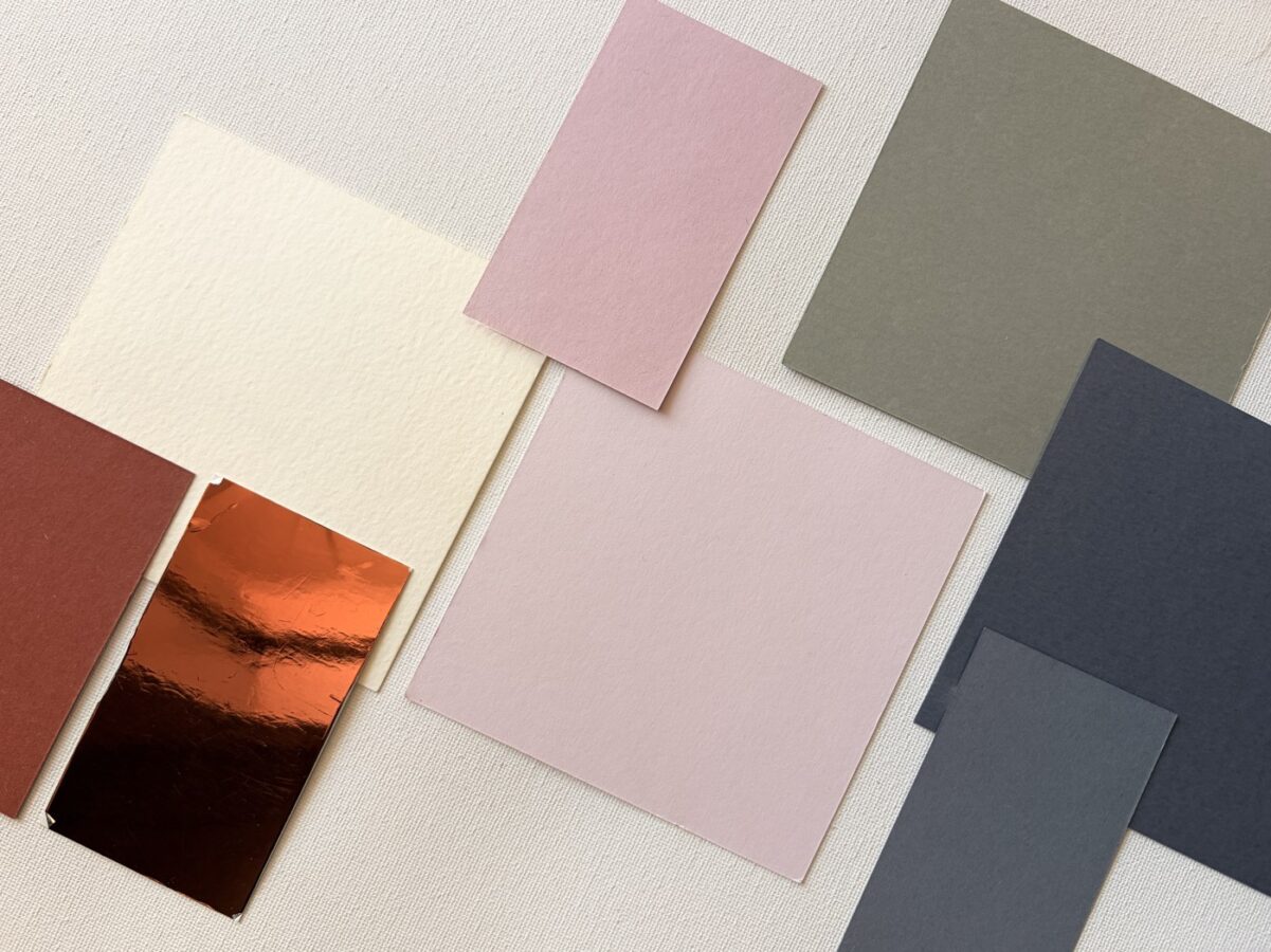
- Terracotta — grounded and sun-baked, but nowhere near as heavy as a true rust.
- Dusty rose or clay pink — the monsoon-sky pink, muted enough to read as sophisticated rather than sweet.
- Sage or desert olive — the green that actually grows here, rather than a forest green that doesn’t.
- Warm sand or bone — a paper base that reads as ivory in daylight and candlelit at night.
- A single sharp accent — antique brass, deep ink, or a bronze foil that catches the light.
The magic is in the restraint. Four soft tones and one moment of contrast will always feel more considered than seven colors competing for the same attention.
Let texture do what color can’t
When a palette is this quiet, texture is what gives it luxury. This is where the choices stop being about color at all.
Handmade paper with a deckled edge. A vellum overlay that softens the invitation beneath it. Blind letterpress — an impression pressed into thick cotton stock with no ink at all, so the design is felt more than seen. Envelope liners in a pattern pulled from the venue’s tile or the botanicals on the property.
A restrained palette with rich texture is elegant. A restrained palette on flat, thin stock is just pale.
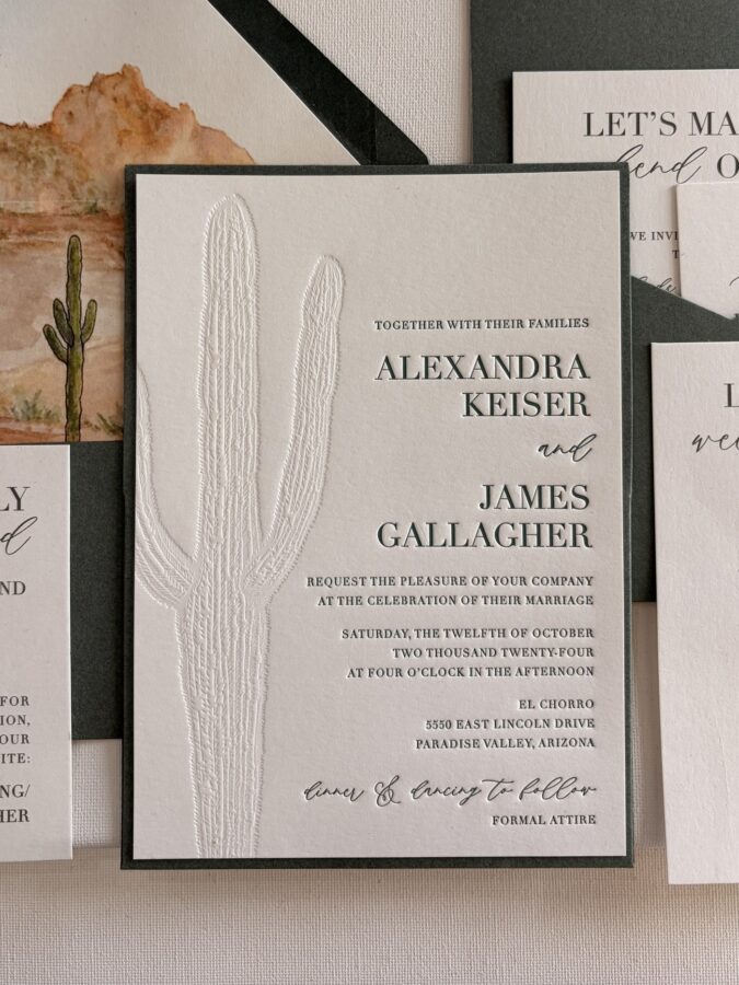
When the color is quiet, the paper has to speak.
Design for the envelope in the mailbox
One practical note that gets overlooked: your invitation will be seen for the first time in an entryway, under fluorescent hall light or afternoon glare — not in the golden hour you designed it for.
Soft tones can wash out entirely in that setting. It’s why we almost always anchor an in-between palette with one saturated element — a fully colored envelope, a wax seal, a wrap in the deepest tone of the palette. It gives the piece enough weight to survive the mailbox, and it makes the softness inside feel like a reveal.
Carry the palette all the way through
The invitation sets an expectation. The day should keep it.
Menus, place cards, ceremony programs, signage, the cocktail napkins, the little thank-you note at each seat — when these all speak the same visual language, guests register it as intention, even if they never consciously name why the day felt so cohesive. That thread is the whole point of a designed suite, and it’s what we build for every couple we work with.
Planning a late-summer or early-fall wedding? We’d love to design a suite that belongs to your season and your light. Reach out at beinlovedesigns@gmail.com to start with a complimentary consultation.