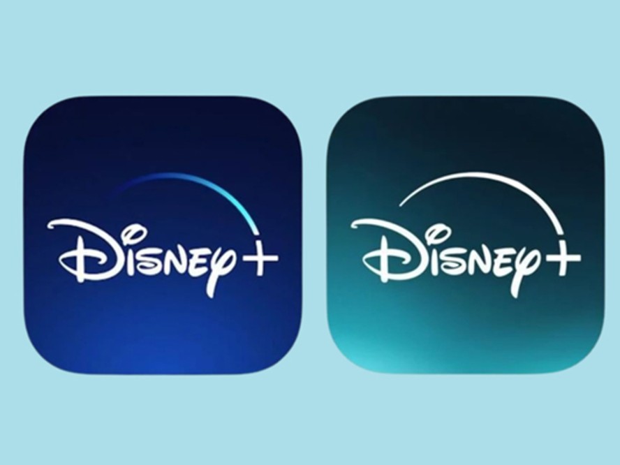
The moment a business decides its brand looks tired, the first instinct is almost always the same: redesign the logo. It feels like the biggest, most visible move. It also skips a real question — is the logo actually the part that’s aged?
For a lot of businesses, it isn’t. The mark is fine, sometimes better than fine. What’s dating the brand is everything around it: a palette that no longer feels current, photography pulled from three different photographers with three different sensibilities, a website template that hasn’t kept up with the studio’s actual work. A logo change won’t fix any of that. And a good logo, changed for the wrong reasons, is a hard thing to get back.
There is a version of a refresh that leaves the mark alone and updates the layer around it. For a lot of businesses, it’s the right move.
The Logo Usually Isn’t the Problem
Logos are built to last, and when they’re done well, they should. A brand that felt slightly outdated at year five will often look considered again at year seven, once the surrounding pieces have been brought up to date. The logo is the constant; the environment is what shifts.
The exception is a logo that’s actually broken — one built in a program the studio no longer has, exported at the wrong resolution and never redrawn, or borrowed from a template. That’s a real rebuild. But a mark that still holds up visually, still reproduces well, and still says something true about the business is not what needs your budget.
What Refreshing Without Rebuilding Looks Like
Palette. Colors date faster than logos do. A palette chosen five or six years ago for a small business often reads as “of that year” now — a specific shade of pink, a mid-decade teal, a coral you can nearly date on sight. Refining the palette, adding two or three neutrals it never had, or shifting one accent color a few degrees can reset a brand’s mood without redesigning anything.
Typography beyond the logo. Most brands have a wordmark and one or two supporting typefaces. The supporting typefaces are often where the aging happens — the body font on the website, the pairing on business cards, the display face on social graphics. Updating those, or tightening the way they’re used, changes the read of a brand more than most people expect.
Photography direction. A brand with a strong logo and inconsistent photography still looks inconsistent. Deciding on the mood of the photography — the light, the palette inside the image itself, the composition style — and then holding the next year of images to that standard is often the single highest-leverage refresh a small business can do.
Collateral, top to bottom. Business cards, email signatures, invoices, one-sheets, social templates, PDF proposals. Any of these that were made hastily years ago will pull the whole brand down with them, no matter how strong the logo is. Rebuilding the working set — the ten or twelve pieces the business actually sends out most — is more visible than a logo redesign, and a lot less risky.
When You Do Need a New Logo
There are cases where a logo change is the right call. If the business itself has changed — a new name, a new category of work, a new audience the current mark doesn’t speak to — the logo is asking to be reconsidered. If the mark was a template or a hand-me-down that never really belonged to the business, that too. If, honestly, the logo has never worked and everyone has been quietly hoping it would grow on them.
Everything else is worth pausing on. A logo change is one of the most disruptive moves a brand can make. It costs signage, print inventory, digital assets, social recognition, and the moment of familiarity a returning customer feels when they see something they know. If you make that move, it should be because the mark itself is genuinely no longer right — not because the palette and the photography and the business cards have aged around it.
A Simpler Test
Before commissioning a new logo, ask a different question first: if we updated the palette, the typography, the photography, and the working collateral, would the logo still feel out of place? For most businesses, the honest answer is no. The mark, freshened up by the world around it, will look right again.
If some of the signs of an aging brand sound familiar, the fix may be smaller than you think — and quicker to make.
Let’s Talk
We’d love to talk through where your brand is now and where it could go. Reach out at beinlovedesigns@gmail.com and let’s start the conversation.