Most companies think about an incentive trip in terms of the trip. The resort, the excursions, the closing dinner, the moment the winners walk in and realize the company actually meant it.
That week matters. But it is five days out of a program that runs for a year, and it reaches only the people who already won. The other eleven months — the stretch where the goal is announced, tracked, chased, and either believed in or quietly forgotten — is where an incentive program earns its budget. It’s also, in most organizations, the part nobody designs.
The Problem With a Program You Announce Once
Here’s the pattern we see. The program launches in January with a strong kickoff: a slide at the sales meeting, an email with a photo of the destination, real enthusiasm in the room.
Then February. Then March. A leaderboard goes out as a spreadsheet attachment. By April the destination has become an abstraction — a word in a subject line rather than a place anyone can picture. The people in the top ten are still motivated because they’re winning. Everyone else has quietly reclassified the trip as something other people get.
That’s not a motivation problem. It’s a visibility problem, and it’s a design one.
Making the Destination Feel Real, Early
An incentive works when someone can picture themselves there. That’s a much higher bar than knowing the name of the resort.
The announcement piece is where this starts, and it’s worth more than an email. A physical mailer to a home address — a well-made card, a small object, something with texture — does something a digital announcement can’t. It gets opened at the kitchen table, in front of a spouse. And the spouse is, frankly, one of the most underrated forces in incentive qualification. A trip that becomes a household conversation in January is a trip someone is still working toward in September.
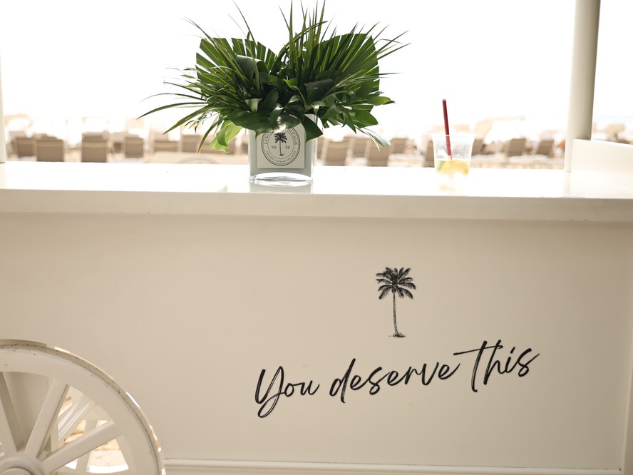
Beyond the announcement, the destination needs a visual identity of its own: a program name, a mark, a palette, a photographic direction. Not the corporate logo with a palm tree beside it. Something that belongs to this program, this year, so that every touchpoint for the next twelve months is instantly recognizable as the trip.
Designing the Middle
The middle of the qualification period is the hard part, and it’s mostly a rhythm problem.
Progress, made visible. A leaderboard is a design object, not a spreadsheet. When standings arrive looking considered — clean typography, the program’s colors, a clear read on the gap between where someone is and what they need — people look at them. When they arrive as a raw export, people skim and close.
Milestone moments. Build in three or four touchpoints across the year that aren’t standings updates: a piece revealing one experience on the itinerary, a note when someone crosses the halfway mark, a card for the group sitting just outside the cut with a real number attached. Each is a small, inexpensive print or digital piece, and each one restarts the conversation.
The final stretch. The last eight weeks deserve their own push. This is when people who thought it was out of reach can still get there, and when the strongest performers decide whether to coast. A well-timed piece here often moves more revenue than the kickoff did.
Congratulations, done properly. Qualifying should feel like an event. The email confirming it is the minimum; a mailed piece — something a person can put on a desk — is what makes it real, and it’s what colleagues ask about.
The Case for Treating It as One Program
Read that list again and the through-line is obvious: it’s a campaign. A year-long one, with a beginning, a middle, and an end, aimed at a specific audience with a specific action in mind.
Companies rarely resource it that way. The announcement gets designed. Everything after it gets improvised by whoever has time that month — which is why the pieces drift out of alignment and the program slowly stops looking like a program.
When it’s designed as a whole from the start, the year holds together. The announcement, the standings, the milestones, and the on-site materials all speak the same visual language, so that by the time guests arrive the identity is already familiar — the design layer that makes the trip itself land is the same one they’ve been looking at all year.
A Place to Start
If you’re planning next year’s program, sketch the full twelve months before you finalize the destination. Mark every point where a qualifier hears from you, and count them.
If the answer is two — a kickoff and a congratulations — there’s a year of opportunity sitting in the gap.
Let’s Talk
We’d love to talk through the program you’re building and how the year leading up to it could be designed better. Reach out at beinlovedesigns@gmail.com.